

BOLD & ENERGETIC BRAND IDENTITY for Lumina
RESTAURANT TECH
Lumina is the always-on, boundary-pushing digital landscape for modern restaurants. With Lumina, store owners craft seamless, consumer-friendly experiences that bridge broader business and draw communities together. ilovecreatives Studio was tasked with creating a dynamic and holistic brand system that not only visually delights, but also feeds their audience with nutrient-rich information.
Objective
Services
Brand Strategy
Logo Design
Copywriting
Website Design
Art Direction
Logo System that
unlocks freedom
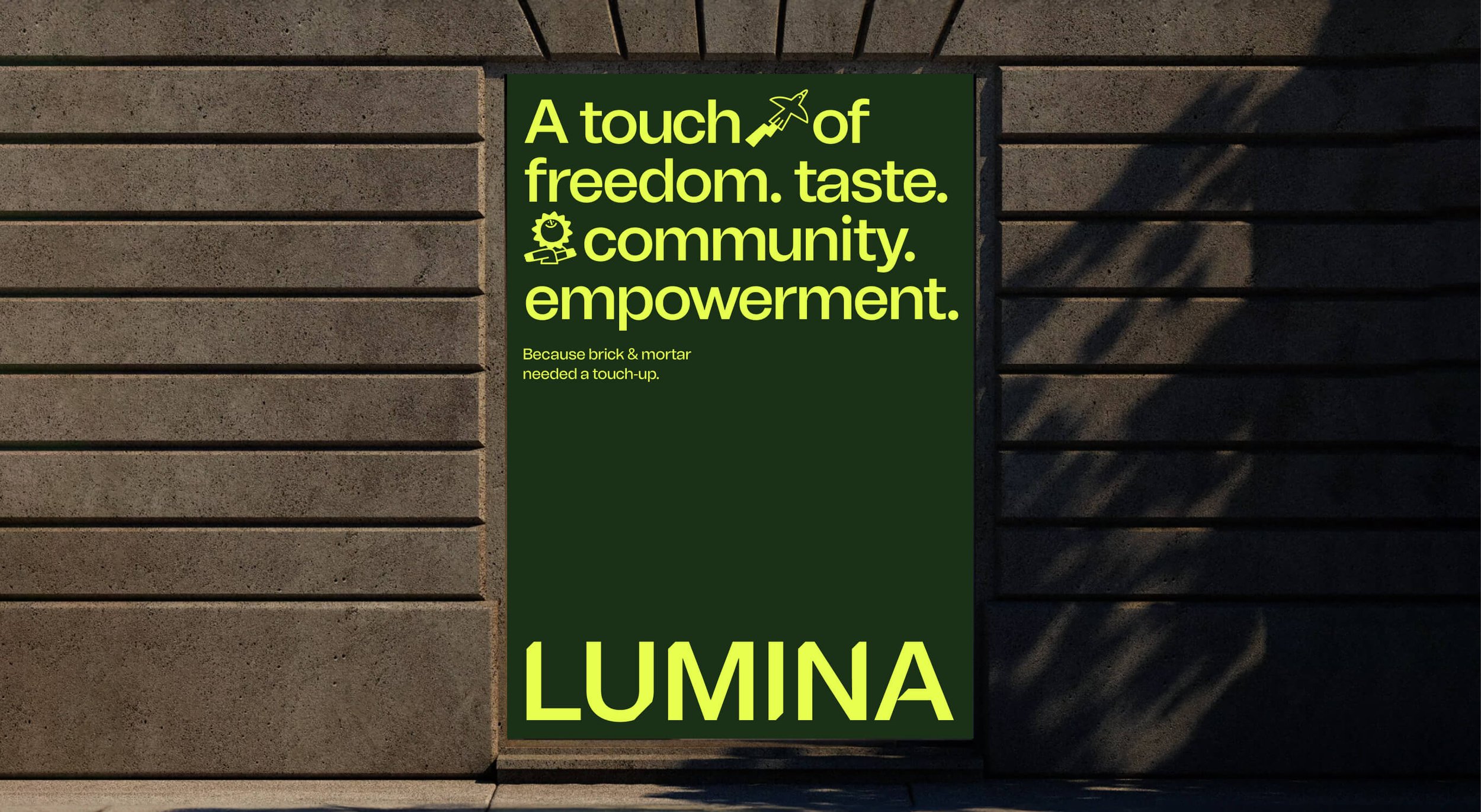
The visual identity is centered on the relentless ease that Lumina brings to restaurants, allowing them to grow on their own terms. Our goal was to capture the turning moment of scaling up without any barriers, conveying a sense of freedom and energy. To achieve this, we crafted a logo system utilizing brackets to represent how Lumina can grow with you at any stage, allowing the inside circle to swap out with different illustrations.


full spread
Icon Library
As we all know, we eat with our eyes first. To create a visual feast for the eyes, we infused vibrant colors, icons fused with bold type, and high flash vibrant food photography.


No. ① — color palette
No. ② — typography


No. ③ — art direction & website
dynamic
Icon System

We executed an icon system that can be easily integrated into messaging to deepen its meaning and a dynamic twist. Capturing Lumina’s innovative spirit, we also visualized concepts that weren’t too on the nose, like security being represented by a cloche.

cooking up a
Digital Experience
We set out to create a website that served up an intuitive, robust, and enjoyable experience. We strategized from the ground up across the site. We introduced a megamenu that allows you to navigate to specific areas of pages that are most relevant and Solutions pages that highlight the top 3 ways Lumina helps restaurants grow.


Work

No. ① — 360 brand Launch

A 360 rebrand from full brand identity, to on-model and still-life photography, and an immersive custom beauty product user experience on the website.
No. ② — full brand identity
A colorful and vibrant brand identity for The Leap. Highlighting human connection and inspiring people to keep the journey exciting as they make the leap.
No. ③ — Custom Packaging

Rook & Rose is “not your average flower shop” – they carry a distinct confidence and bold personality. The Studio designed their expressive rebrand to reflect just that.
No. ④ — UX/UI

A dynamic, inviting, and fresh brand identity that emcompasses shared values of unfiltered self expression, authenticity and empathy.