

creating a digital world for Communia
SOCIAL NETWORK APP
The Communia brand needed to establish an identity that represented its new name (previously Restless Network) and expressed their mission and offering in a fresh new way. ilovecreatives Studio partnered with the Communia team to create the dynamic and fresh brand identity that emcompasses shared values of unfiltered self expression, authenticity and empathy.
Objective
Services
Brand Identity
Web Design
App
UI/UX
Social
Email
No. ① — custom wordmark logo and app icon
safe and inviting
Brand Identity
Each brand element comes together to create a beautiful juxtaposition that inspires, feels creative, and provides warmth. The sunset gradients represent how Communia feels like a digital hug, inviting people into a cozy zone.
No. ① — wordmark graveyard. RIP 🥀
Vibrant
App Reskin
Embracing feminine beauty and creating a UI/UX design language that communicates warmth and safety, the app reskin invites users to comfortably express themselves.
No. ① — mobile friendly homepage
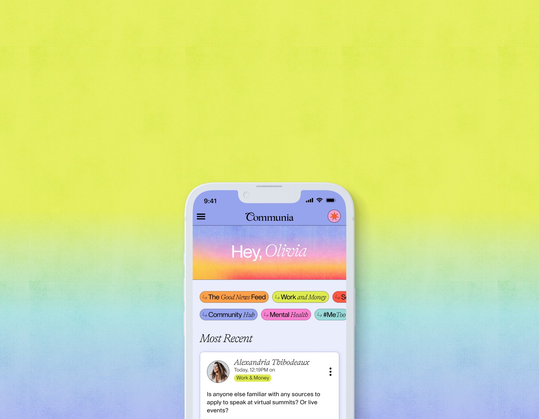
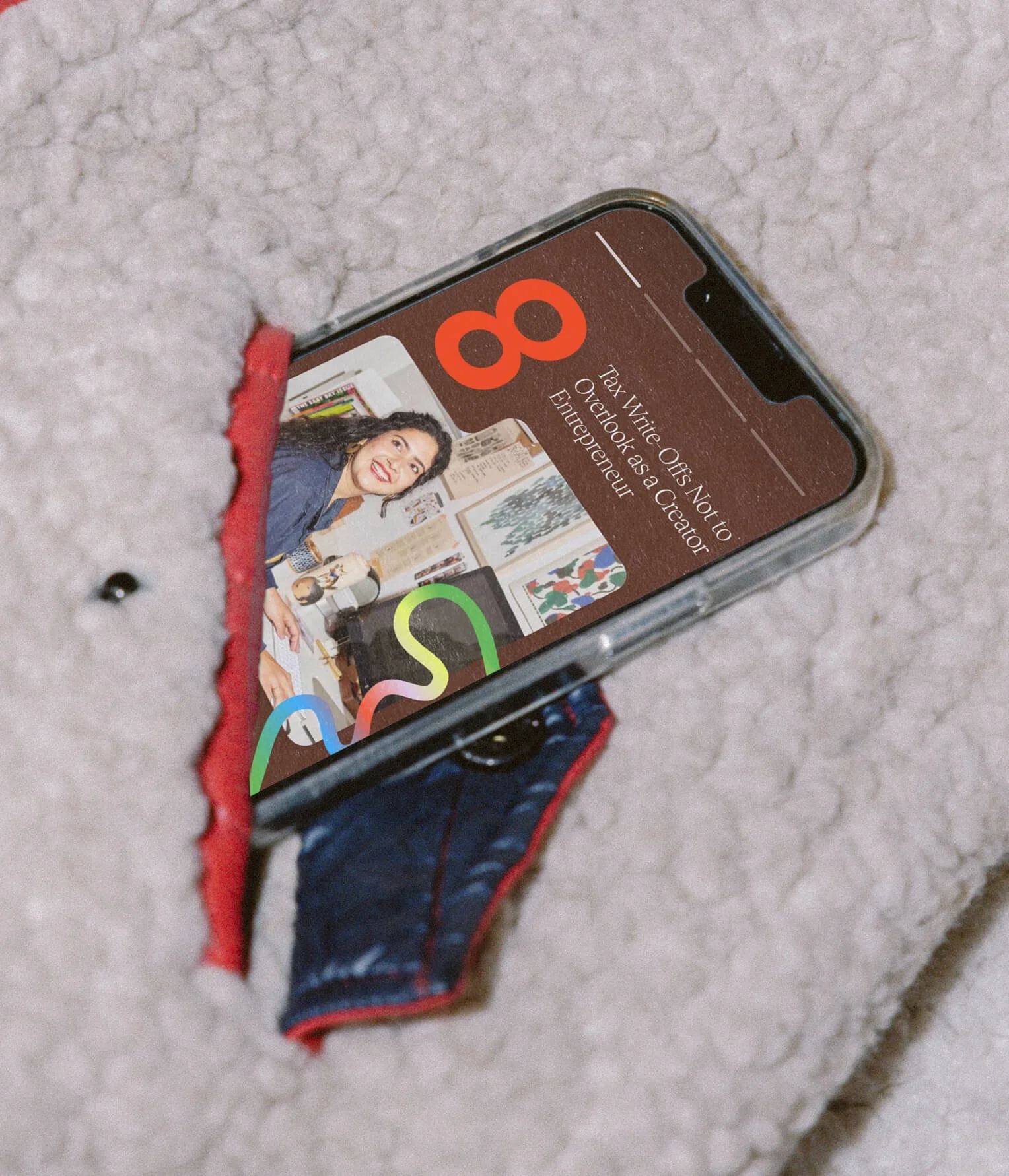
No. ① — communia app screens - home feed, article, and messages

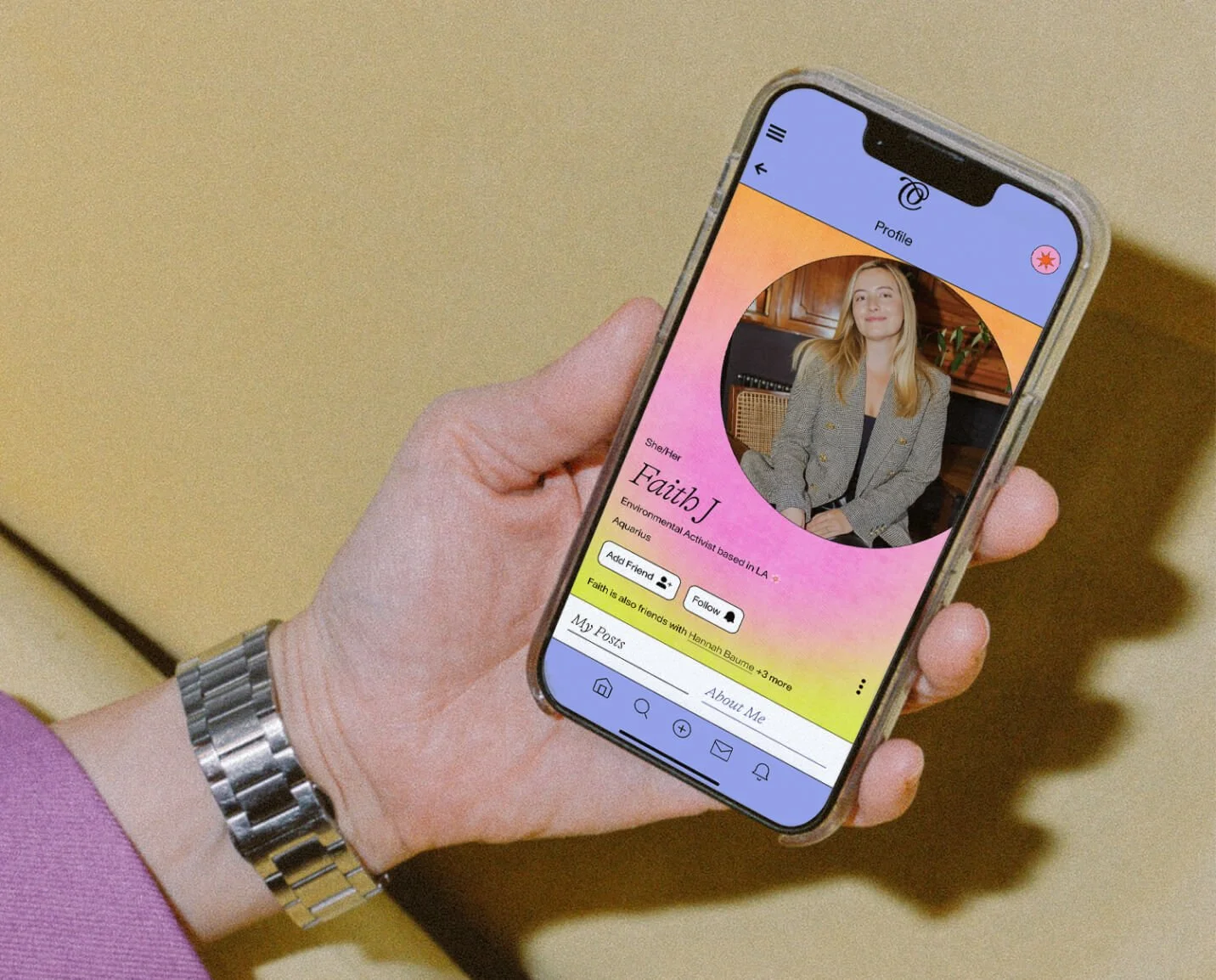
No. ① — profile page on the communia app
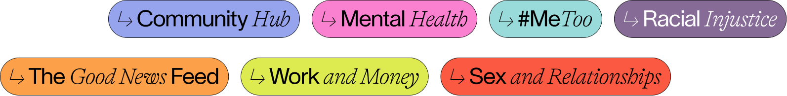
No. ① — updated topic colors that inspire and better match the topic
playful
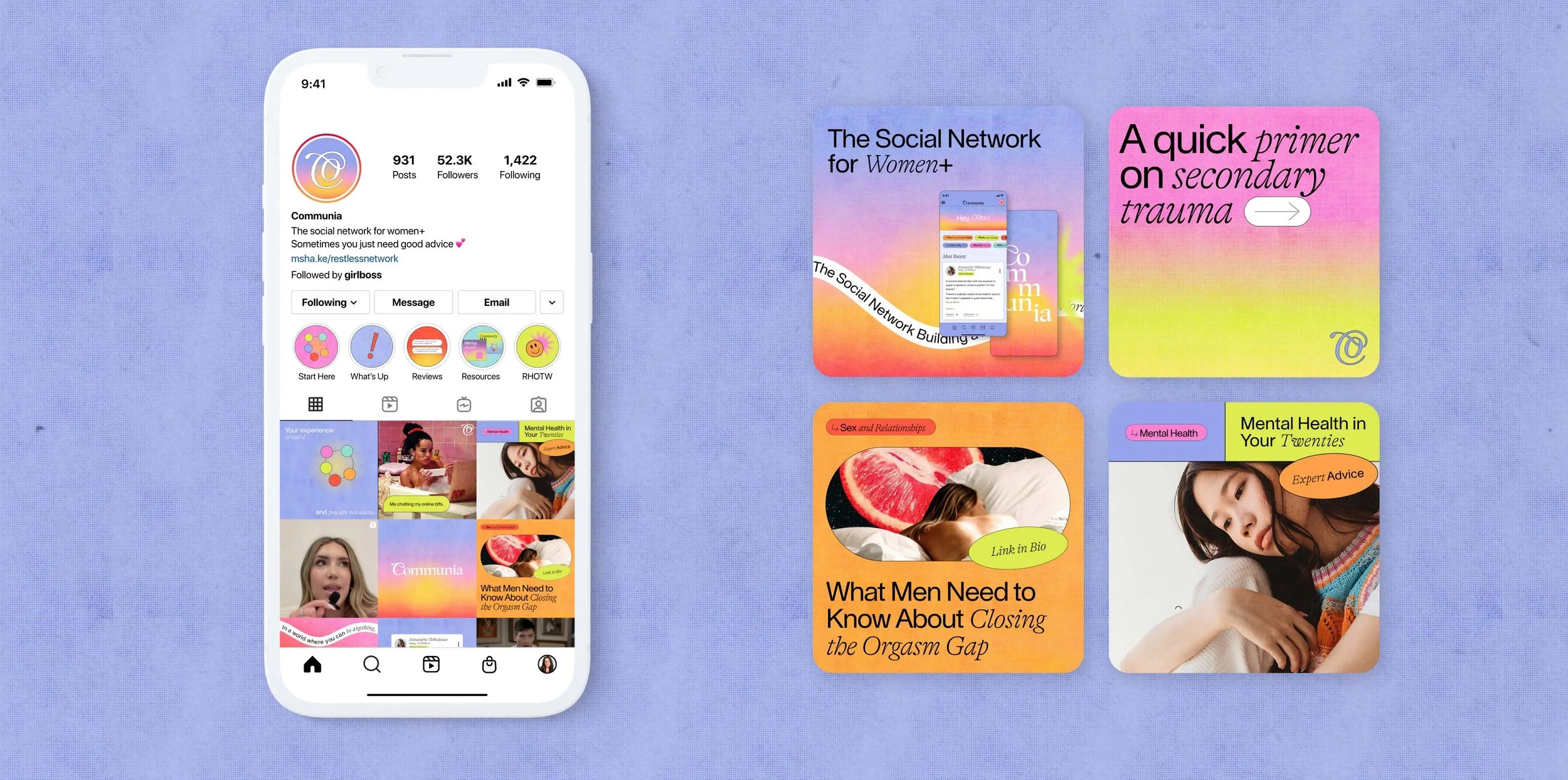
Social Templates
Serious and deep topics can be sensitive. The social design keeps that in mind and allows Communia to communicate in a way that recognizes the gravity of serious topics while highlighting the beauty of vulnerability.


Immersive
Website Redesign
With a strong mission comes strong web design to invite users into the beautiful world of Communia. Information and connection are at the core of this redesign with a goal to explain the app and highlight its brilliant features, while connecting with its audience.
No. ① — article page on mobile


No. ① — Redacted journal landing page on desktop
Work

No. ① — logo reveal animation
A 360 rebrand from brand identity, to Girlboss Radio podcast, and a multilayered website experience that encompasses shared values of inclusion, representation and playfulness
No. ② — full brand identity
A colorful and vibrant brand identity for The Leap. Highlighting human connection and inspiring people to keep the journey exciting as they make the leap.
No. ③ — Custom Packaging

Rook & Rose is “not your average flower shop” – they carry a distinct confidence and bold personality. The Studio designed their expressive rebrand to reflect just that.
No. ④ — UX/UI

A dynamic, inviting, and fresh brand identity that emcompasses shared values of unfiltered self expression, authenticity and empathy.