

Brand refresh for Rook & Rose
Not your average floral shop
In 2022, Rook & Rose was blossoming beyond their local roots in Victoria, BC as they expanded throughout the US and Canada. To express their unique personality as they introduced themselves to international customers, the Studio completed a full rebrand including new colors, typography, packaging, store collateral, and a unique new website.
Objective
Services
Brand Identity
Web Design
Web Development
Packaging
Collateral
Expressive
Packaging
Rook & Rose is “not your average flower shop” – they carry a distinct confidence and bold personality, contrary to many delicate and flowery florists. The Studio designed their expressive packaging to reflect just that. It combines the colorful nature of floral design, in a loud and artful way.


No. ① — secondary packaging

No. ➁ — Typography Palette


No. ➂ — Color palette, mixing earthy natural tones with vibrant pops of neon and cobalt
No. ➃ — secondary packaging
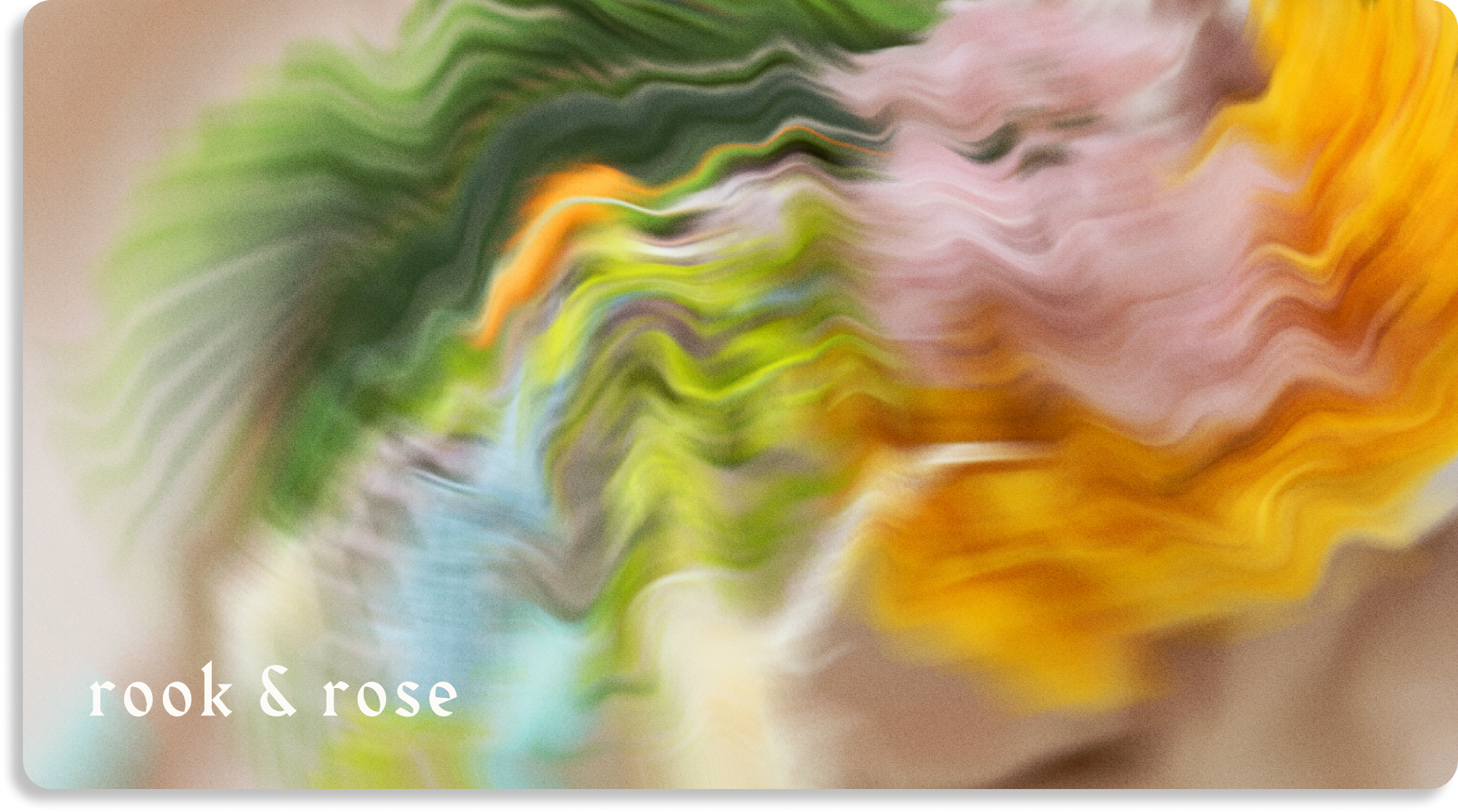
Abstract Floral Art
Using existing floral photography provided by the Rook & Rose team, we created abstracted graphics that blend the colors of each flower together.


Fresh e-commerce
Web Design & Development
The Studio built out a fresh new website that showcased Rook & Rose offerings such as dried flowers, fresh flowers, and lifestyle goods.

No. ➄ — Shop all page

No. ➅ — Shop All Page

The loading screen experience was immersive and memorable, using the abstracted images created during the brand identity.
No. ➆ — mobile landing page
Curate a box
Design & Development
To increase conversions and cross sell their offerings, the Studio designed a unique experience for customers to curate their own gift box with Rook & Rose products. The Curate A Box purchases were then delivered with the specialty abstracted packaging.


unique
Collateral
The refreshed brand identity was rolled out into each touchpoint of the brand. We carried the bold expressionism into the collateral design, using softer colors with the abstracted art.


Store
Materials
The brand refresh was also carried into the physical store in Victoria though newly designed gift certificates, product tags, signage, wrapping paper and more.


Work

No. ① — 360 brand Launch

A 360 rebrand from full brand identity, to on-model and still-life photography, and an immersive custom beauty product user experience on the website.
No. ② — full brand identity
A colorful and vibrant brand identity for The Leap. Highlighting human connection and inspiring people to keep the journey exciting as they make the leap.
No. ③ — Custom Packaging
Rook & Rose is “not your average flower shop” – they carry a distinct confidence and bold personality. The Studio designed their expressive rebrand to reflect just that.
No. ④ — UX/UI

A dynamic, inviting, and fresh brand identity that emcompasses shared values of unfiltered self expression, authenticity and empathy.