leveling the playing field with The Gist
SPORTS MEDIA BRAND
Objective
The GIST is a women-founded and operated sports media brand that’s leveling the playing field in sports. To modernize and elevate the brand, ilovecreatives Studio landed on an energetic, editorial, and playful brand identity.
Services
Brand Identity
Web Design
Illustration
Merch
Email
Social
Presentation Decks
REFRESHED
Logo Design
The Gist wanted an updated and modernized version of their logo, while maintaining the editorial and expressive ‘G’.
No. ① — wordmark logo
Playful and sporty
Art Direction
The goal of the overall branding was to level the playing field and invite everyone into the sports conversation, not just a traditionally masculine audience. Featuring a fresh and rich color palette inspired by traditional sports colors, but with a twist of playful tones and pops of energy. Paper, black, and white anchor the palette in its editorial roots and are used for high contrast moments.
The typography palette features a pixelated font inspired by digital scoreboards, a condensed serif font that is reminiscent of vintage editorial styles, and a contemporary sans serif that is slightly mechanic and highly legible. Together, they create an editorial feel that is passionate about sports news.
No. ② — Color palette and typography
Custom Illustration
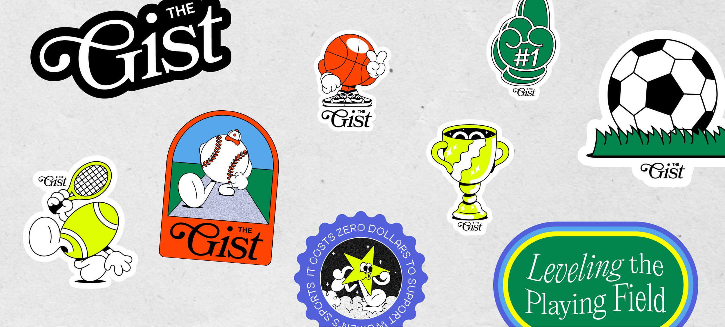
The Studio collaborated with Gavin Connell to create a playful and expressive icon system for The Gist’s robust sports coverage.
No. ③ — playful icons for the major sports that the gist covers
custom
Illustrations
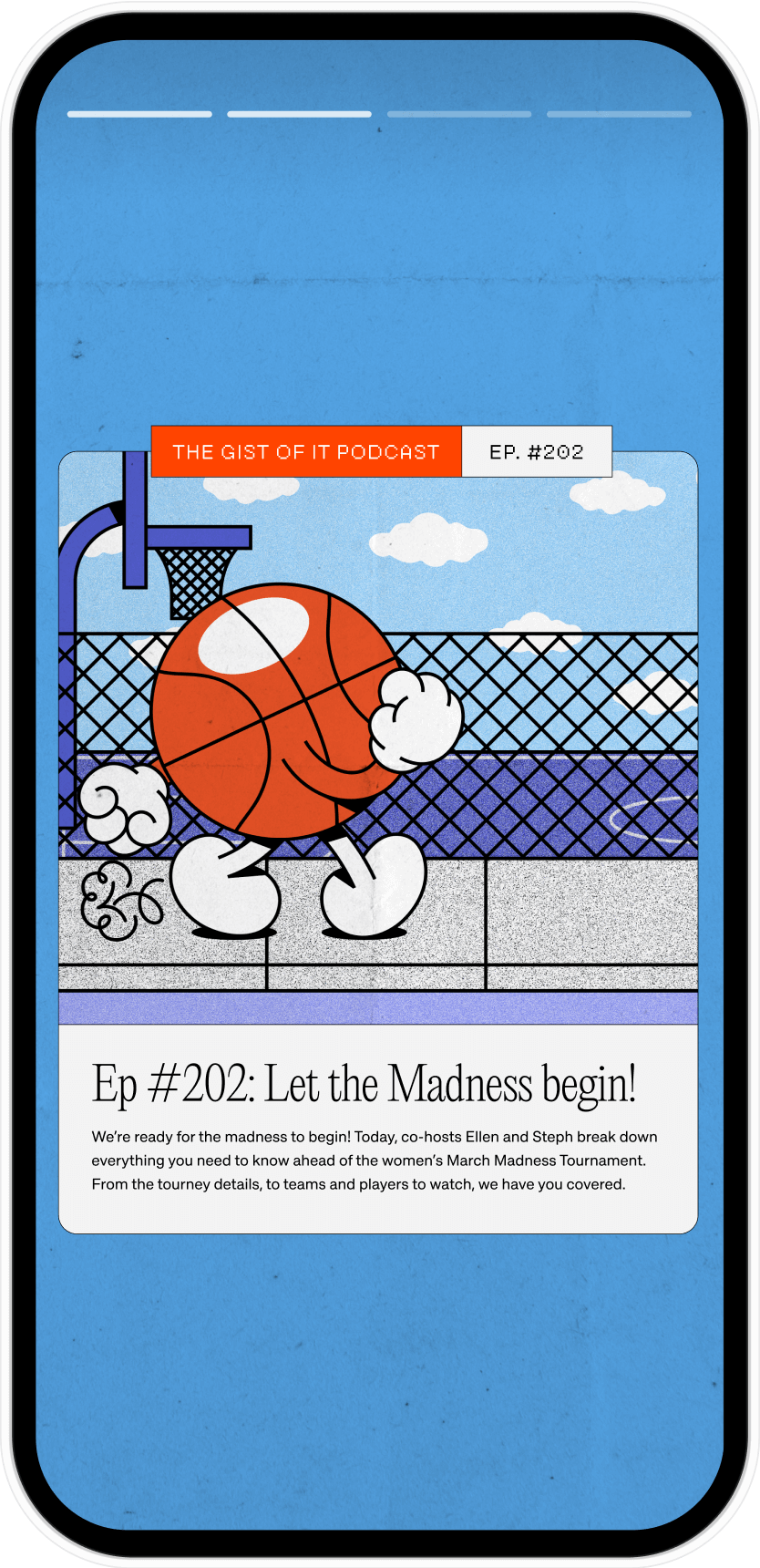
The Studio ideated and concepted illustrations that The Gist could use throughout their channels with an aim to create a fun and engaging world of sports.
No. ④ — she’s a runner, she’s a track star
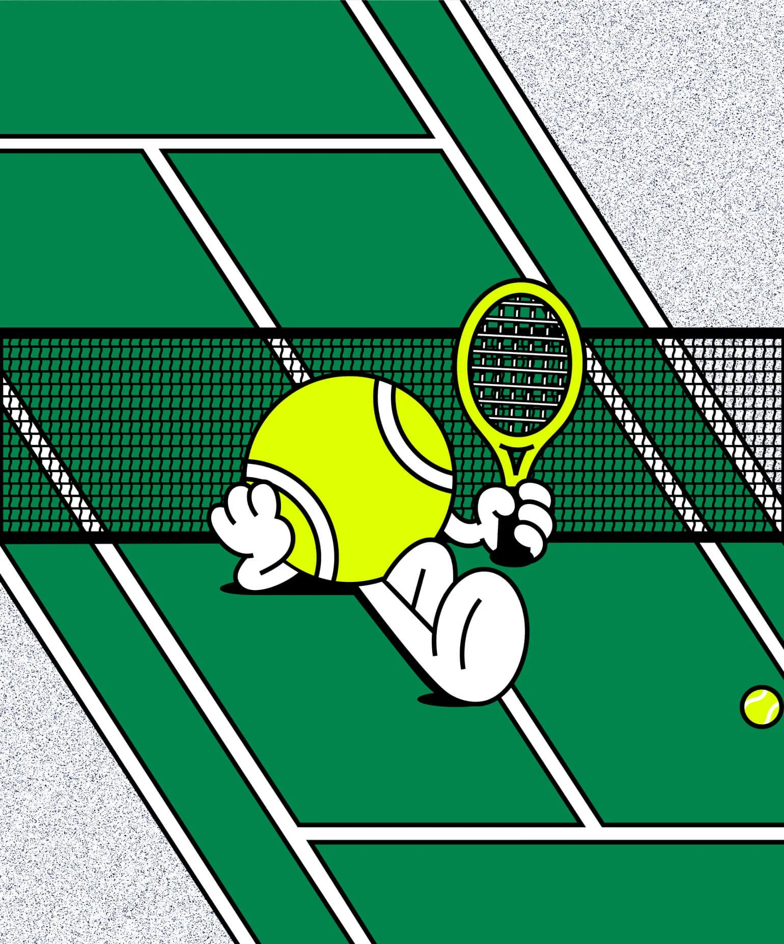
No. ⑤ — chillin’ tennis ball
editorial
Web Design
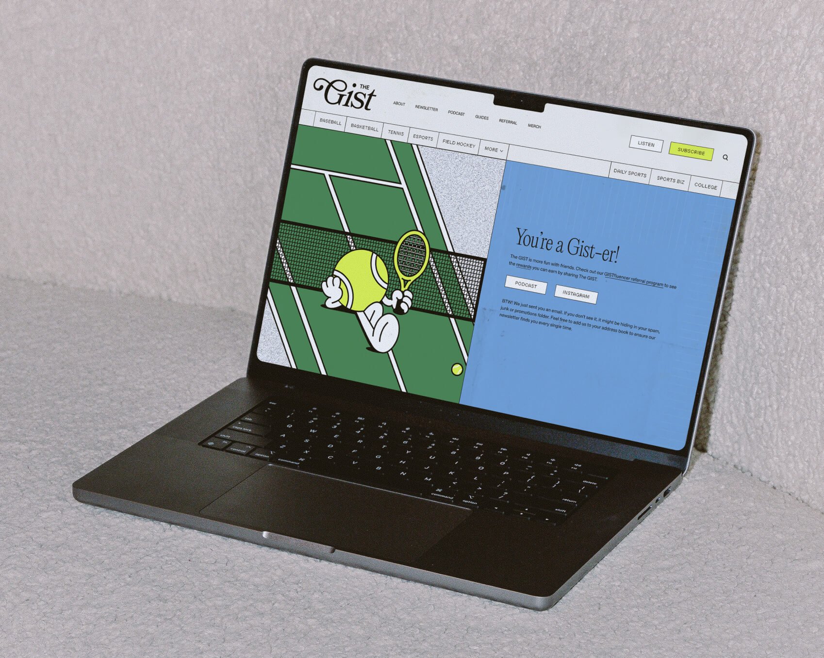
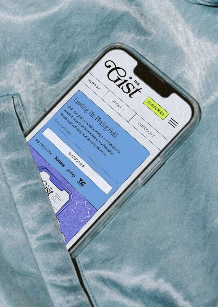
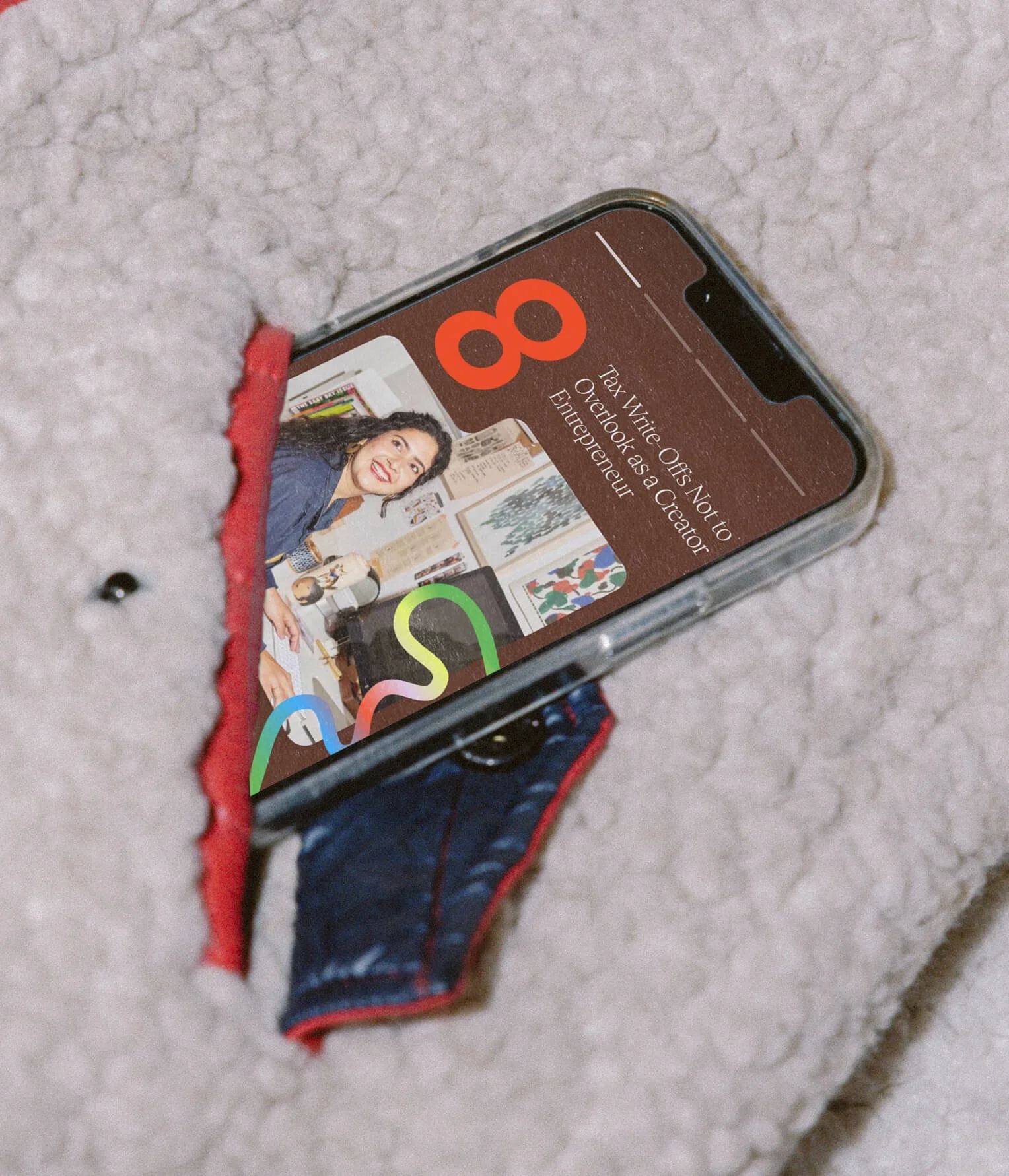
At The Gist’s core is its journalist spirit. To stay true to that, the Studio designed a website that embraces an editorial direction. Readability and ease of scanning were key in the redesign.
No. ⑥ — mobile friendly homepage
No. ⑦ — newsletter sign-up confirmation page

No. ⑧ — captivating homepage
systematic
Newsletter Design
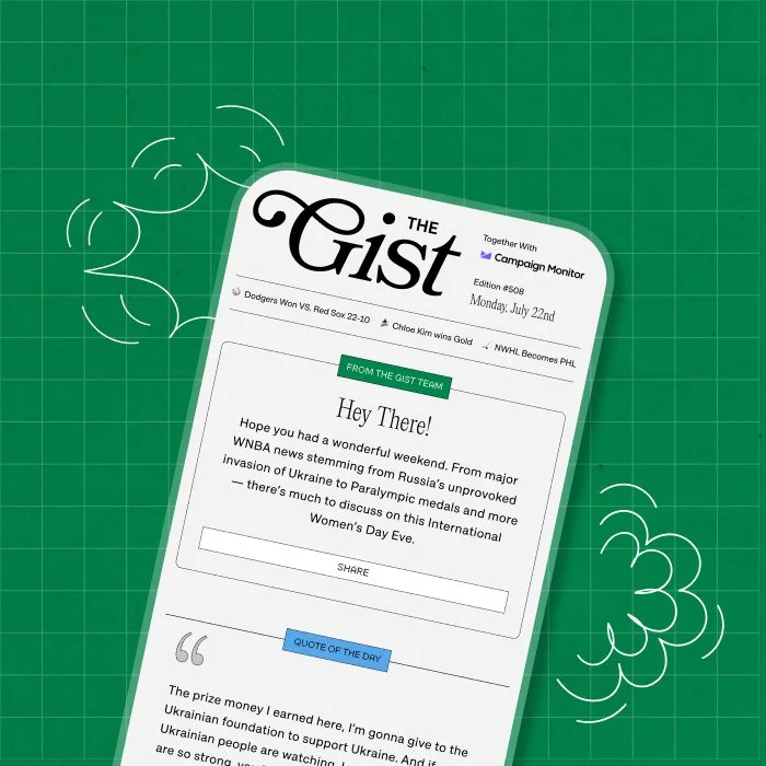
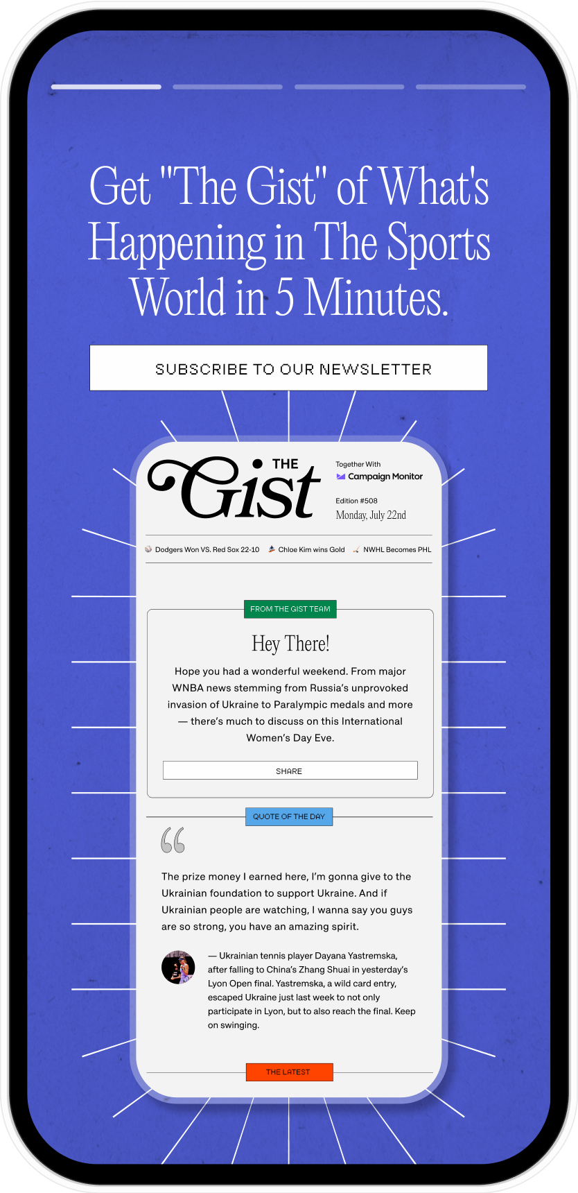
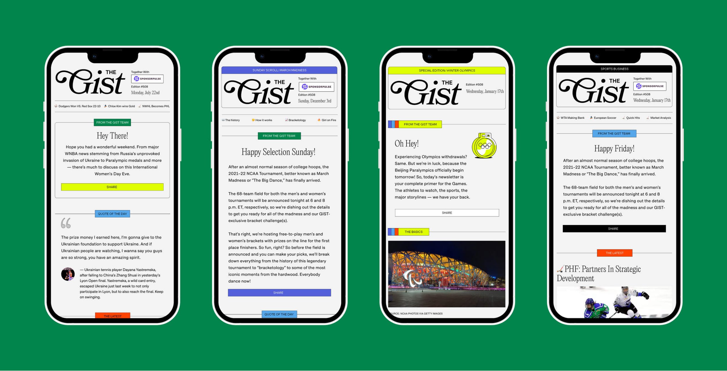
With a unique challenge in designing for multiple verticals within newsletters, the Studio created a flexible design system that gave each vertical its own unique voice while maintaining a consistent and cohesive design language that’s easy to read.
editorial
Social Templates
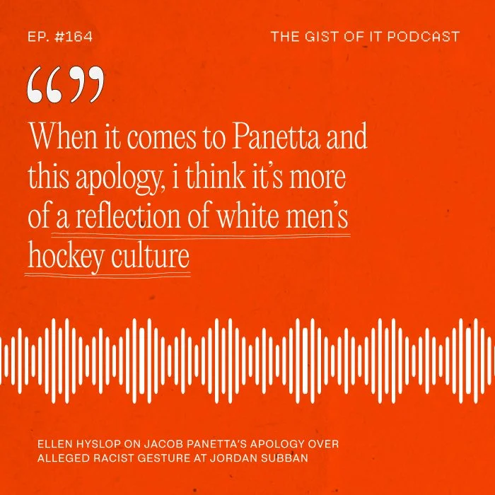
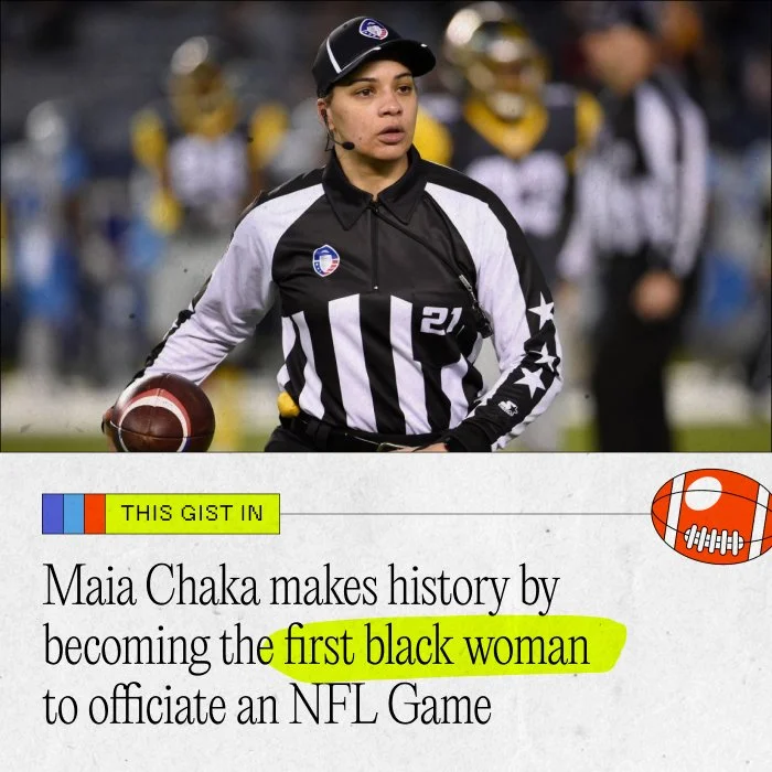
The Studio created a powerful and vibrant design system for social with multiple content buckets across in-feed posts and stories, like Sports News Updates, Quotes, Memes, Announcements, and Branded Partnerships.
No. ⑪ — sports news update post
No. ⑫ — newsletter post
No. ⑩ — podcast quote
No. ⑬ — breaking news post
No. ⑨ — Daily, Sunday scroll, special edition, and sports business newsletters
Merch design
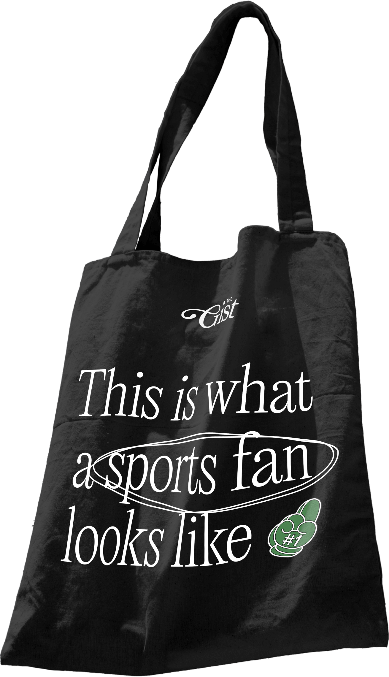
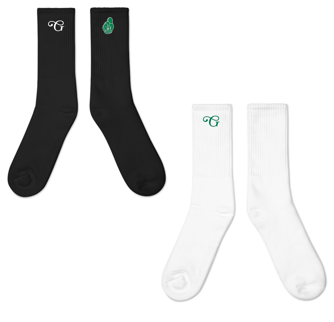
Sports spirit is strong and The Gist’s merch game stays strong. Bold with its messaging, the Studio created merch that redefines what a sports fan looks like.
Work
No. ① — logo reveal animation
A 360 rebrand from brand identity, to Girlboss Radio podcast, and a multilayered website experience that encompasses shared values of inclusion, representation and playfulness
No. ② — full brand identity
A colorful and vibrant brand identity for The Leap. Highlighting human connection and inspiring people to keep the journey exciting as they make the leap.
No. ③ — Custom Packaging
Rook & Rose is “not your average flower shop” – they carry a distinct confidence and bold personality. The Studio designed their expressive rebrand to reflect just that.
No. ④ — UX/UI
A dynamic, inviting, and fresh brand identity that emcompasses shared values of unfiltered self expression, authenticity and empathy.


