

ANIMATION START-UP
making moves with Butter
Butter empowers people to create more with less. We make motion design faster, easier, and more expressive. Instead of complex software with high learning curves, anyone can leverage existing assets to make high-quality content in a few clicks. ilovecreatives Studio partnered with the Butter team to create a dynamic and fresh brand identity that encompasses their values of playfulness, exploration, and accessibility.
Objective
Services
Brand Identity
Brand Strategy
3D Art
Motion Design
Web Design
UI/UX
Email
Social
kinetic & expressive
Logo Wordmark & Symbol
A custom wordmark that is kinetic, optimistic, and expressive. The wordmark curves upwards and subtly becomes larger with each letter to infuse energy and dynamism into the logo. The movement represents the creative flow and how Butter as a product amplifies people’s creativity and ideas.
The symbol captures the playfulness and friendliness of Butter. It layers the ‘B’ from the wordmark at an angled perspective to communicate depth and create upward motion. It embodies the building blocks that Butter provides their users to create elevated motion assets.

No. ➂ — symbol logo
No. ➂ — wordmark logo
immersive
3D World
To breathe life into the dynamic breadth of templates they offer, we created a playful world of 3D graphics to immerse people into a world of boundless creativity, including layered card animations and 3D elements.
Social Design
made with Butter

No. ➃ — 3D elements that represent play, scalability, and different tools within Butter
To communicate and educate people about how you can use Butter, we focused on creating templates that showcase the different types of animation presets available in the product. We wanted to show the flexibility and customization of features, along with using unbranded e-commerce objects so that people could start to envision how they could use Butter for their own products to create engaging content.
No. ➃ — landing page

educational
Email Design
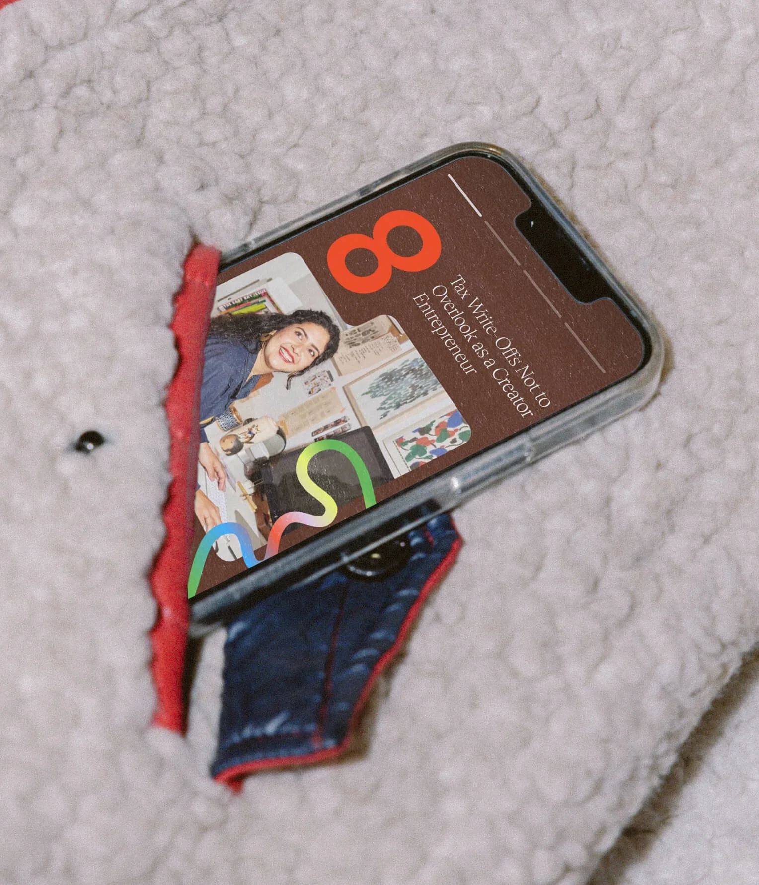
Learning a new tool can be daunting. That’s why we ensured that the newsletter template shows people just how easy it is to start creating in Butter.
Work

No. ① — 360 brand Launch

A 360 rebrand from full brand identity, to on-model and still-life photography, and an immersive custom beauty product user experience on the website.
No. ② — full brand identity
A colorful and vibrant brand identity for The Leap. Highlighting human connection and inspiring people to keep the journey exciting as they make the leap.
No. ③ — Custom Packaging

Rook & Rose is “not your average flower shop” – they carry a distinct confidence and bold personality. The Studio designed their expressive rebrand to reflect just that.
No. ④ — UX/UI

A dynamic, inviting, and fresh brand identity that emcompasses shared values of unfiltered self expression, authenticity and empathy.